

Outages on Success Rate Graph
This document explains the functionality of the feature that plots outages onto the success rate graph. This enhancement helps merchants identify the reasons behind success rate dips by correlating them with potential downtimes of payment methods, such as banks, PSPs, wallets, etc.
Why This Feature?
Merchants often notice fluctuations in their success rates and seek to understand the underlying cause. One common reason could be the downtime of specific banks or payment methods. This feature provides a visual representation of such correlations, enabling merchants to quickly diagnose issues and take necessary actions.
Key Features
1. Graph Markers for Outages
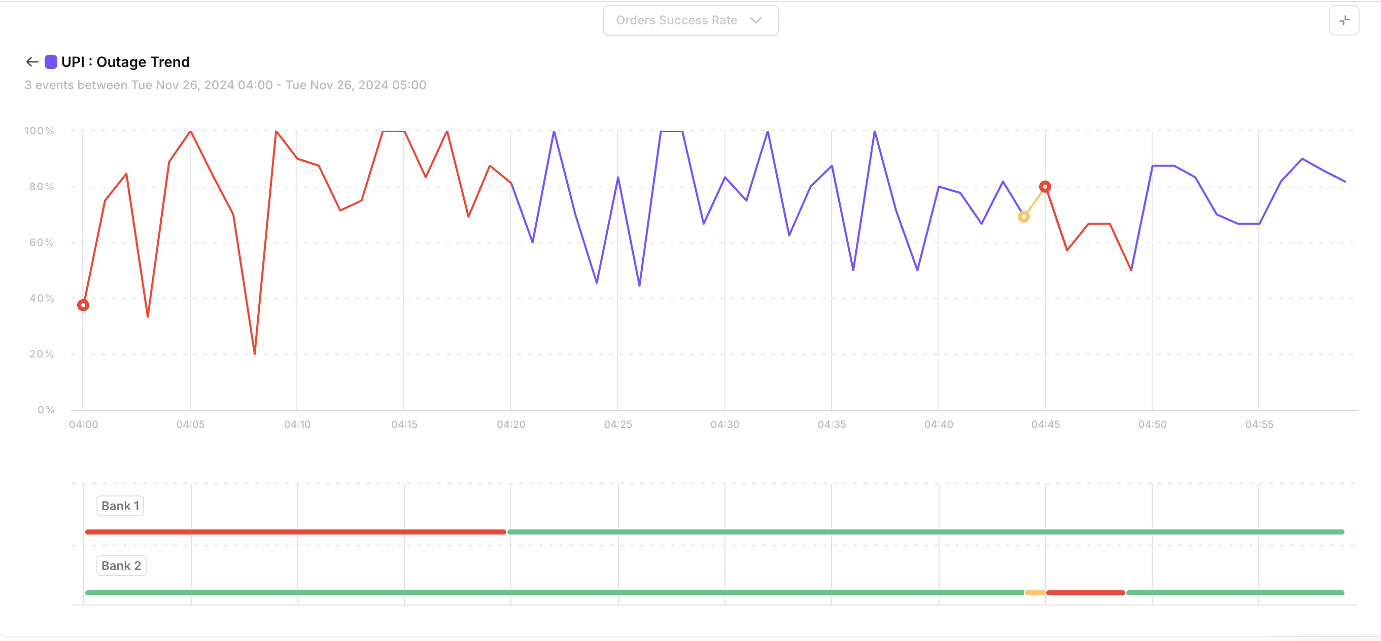
Red Marker: Indicates a downtime during a specific duration.
Yellow Marker: Indicates a fluctuation during a specific duration.
These markers provide a quick visual clue to differentiate between a complete downtime and intermittent issues.
2. Interactive Features
Hover Functionality:
Hovering over a marker reveals:Total downtime/fluctuation observed during that duration.
Click Functionality:
Clicking on a marker zooms into the selected hour and displays:A detailed timeline of outages, plotted at minute-level granularity.
Information about payment methods or banks that experienced downtime or fluctuations during the hour.
Timeline of Outages at Bank / Payment Method Level
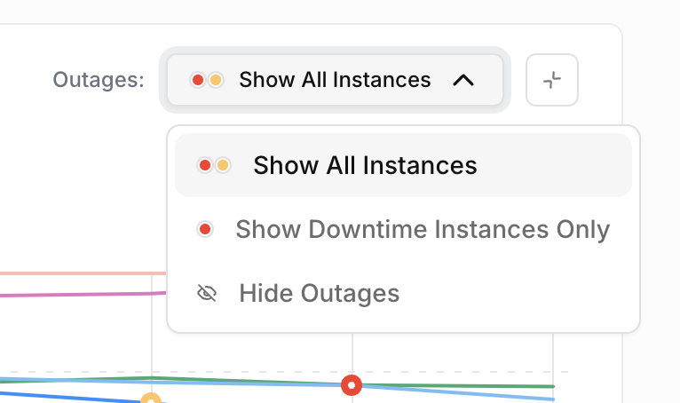
3. Toggle Visibility
Merchants can hide or show the markers for fluctuations and downtimes as needed. This ensures a clutter-free view of the graph, allowing users to focus on the success rate trends without distractions.
4. Dimension-Specific Outages
Outages are plotted specifically under the payment method type dimension.
This ensures clarity and allows merchants to view success rate dips and outages for individual payment types, such as:
Credit/Debit Cards
UPI
Net Banking
Wallets
5. Time Frame
Outages are plotted only for a 24-hour time period. This restriction ensures focused and accurate analysis of success rate dips in a manageable timeframe.
How to Use?
Accessing the Graph:
Navigate to the success rate graph in the dashboard.
(Note: Ensure the time frame selected is within a 24-hour period.)Interpreting the Markers:
Look for red and yellow markers on the graph.
Hover over a marker to view summary details about the downtime.
Click on a marker to zoom into the timeline and view minute-level outage details.
Toggle Marker Visibility:
Use the toggle option to show or hide markers for fluctuations and downtimes.
This allows for a cleaner view of the graph when detailed analysis of outages is not needed.
Detailed View:
The detailed view provides:A timeline of outages at minute-level granularity.
Information about affected payment methods or banks during the selected hour.
Benefits
Quickly identify if a success rate dip correlates with a payment method's outage.
Analyze outages at a granular level for precise diagnosis.
Toggle the visibility of markers for a focused view of the success rate trend.
Make informed decisions and communicate effectively with affected stakeholders.